
Color Story: Dark, Moody Paint Colors
While it is true that much of our portfolio is comprised of spaces with light or mid-toned wall colors, we also love a dark and moody paint moment. Dark shades offer a sense of drama and create movement through a house by encouraging exploration from rooms that are lighter shades. If you spend most of your day in a light, bright space, a dark-painted room can feel especially rich and enveloping. The right dark color can feel equally cool and refreshing in the summer and cozy and warm in the winter. Our preference is often to paint both the walls and the trim the same shades, with a more matte finish on the walls and more sheen on the trim. Dark shades also look spectacular on cabinetry, and wear a little easier than lighter colors.
As always, the most important step in choosing paint colors is to sample them in your own space. While our list of favorites may be a guide, we’d never recommend painting any color that you haven’t sampled first.
Design by Yond Interiors, Photo by Amanda Birnie
Design by Yond Interiors, Photography by Erin Little
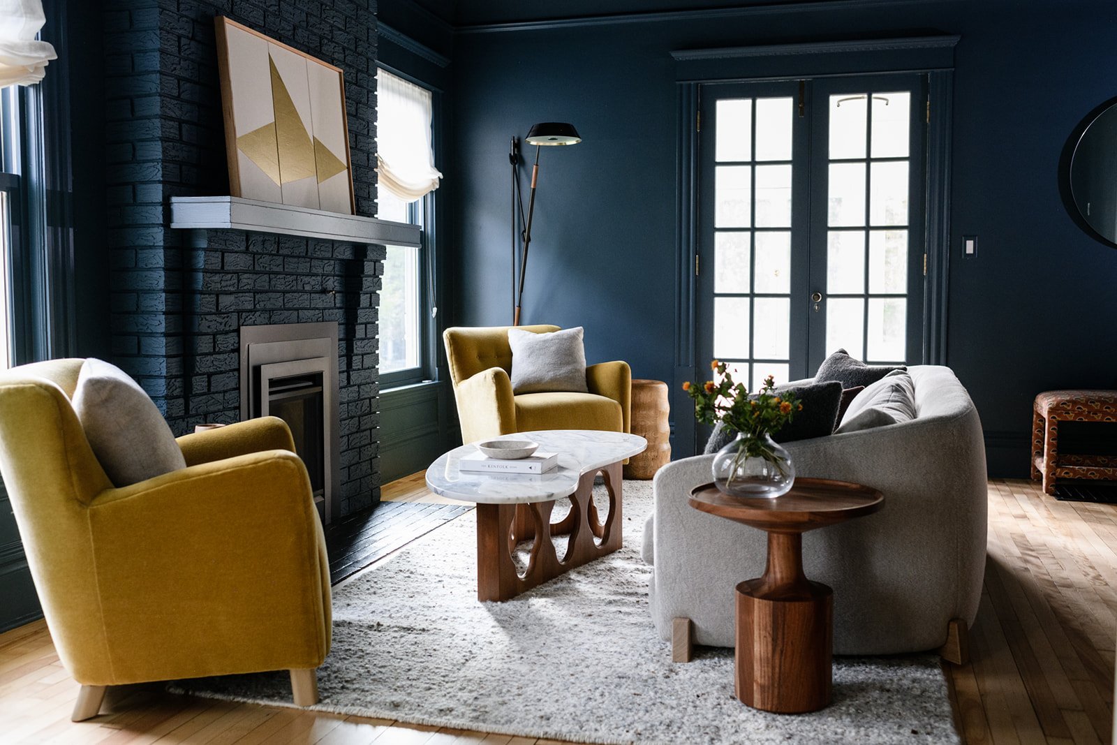
Blues and Greens
Arguably the most livable dark colors, these suit a vanity of styles and pair well with many other shades. Steer clear of using too much bright white in these rooms, else it will start to take on a nautical feel. Instead, look to the opposite end of the color wheel and pair these moody shades with rich yellow, caramel, or gold.
Design by Heidi Caillier, Photography by Haris Kenjar
Our Favorites
Benjamin Moore Newburg Green - A wonderfully nuanced shade that is somewhere between blue and green, and definitely delicious.
Benjamin Moore Fatigue Green - Like your favorite Army surplus bag, plus a dose of sophistication. We love this on cabinetry!
Benjamin Moore Midnight Blue - A dark blue that leans gray, this is another great option for cabinetry or millwork.

Design by Becca Interiors, Photography by Rikki Snyder
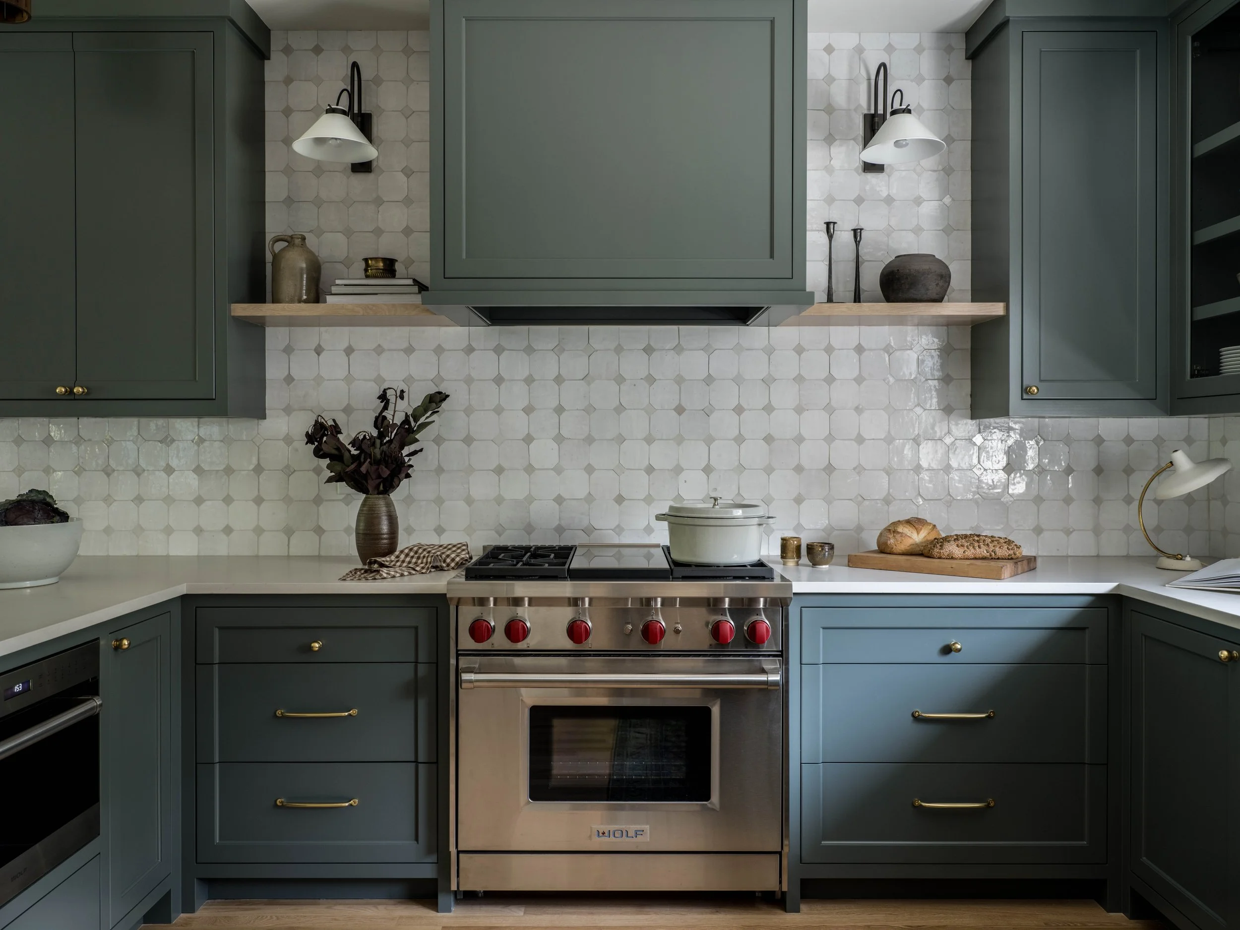
Grays and Blacks
True grays and blacks are the ultimate moody neutrals. Be sure to choose shades that have warm undertones to avoid looking too stark, and introduce plenty of texture with natural wood tones, plush fabrics, and other fibers like rattan or wicker. Dark shades look especially nice with natural materials like wood and natural stones, making them a great option in a kitchen, bath, or other utilitarian space.

Design by Moore House Design, Photography by Erin Little
Our Favorites
Benjamin Moore Cheating Heart - This true dark charcoal is one of the most versatile on our list.
Benjamin Moore Flint - A gray with green undertones, this is one of those chameleon colors that will change with the light.
Sherwin Williams Tricorn Black - A warm black that makes a great accent color for doors, both indoors and out.
Sherwin Williams Urbane Bronze - Ever popular on exteriors, this warm gray has brown undertones.

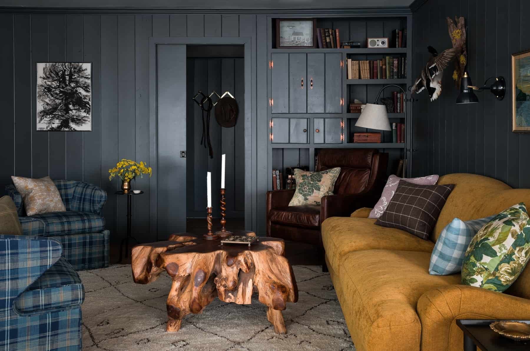
Design and Photo by Chris Loves Julia
Other Shades
While certainly the most common, shades of blue, green, and gray aren’t the only ways to achieve a cozy, moody feel through paint. Textural finishes like plaster or limewash contribute to an overall moodiness, but so do muddy, saturated versions of reds and even purples. Make no mistake, these colors are bold strokes, so you’ll want to include plenty of texture elsewhere in the room to offer balance.

Farrow & Ball’s Paean Black
Our Favorites
Benjamin Moore Fading Twilight - A recent pick for Color of the Year, we think you’ll be seeing much more of this shade.
Farrow & Ball Paean Black - A red-based black that will read purple in most light, and is reminiscent of a sophisticated European pied-à-terre.
SHOP THE LOOK


IN CASE YOU MISSED IT
10 paint colors we love (in different shades!)
You can visit our latest portfolio of work.
Our favorite palettes always include saturated neutrals.
We’re answering the most frequently asked questions for interior designers.