
Color Study: Saturated Neutrals
You may have noticed that our color palette tendencies usually involve a variety of deeply saturated neutrals. Think the richest shades of rust, olive, terra-cotta, ochre, charcoal, and more. We find that super-saturated color tones, when used properly, can work as excellent neutrals without overpowering a space. They add a sense of instant warmth and layer beautifully with a range of well-considered textures and finishes.
Incorporating color can sometimes feel like stepping outside a comfort zone, but don’t let bold tones intimate you. We’re sharing when and how to use saturated neutrals with past and present examples of our design work.

Design: Yond Interiors | Photography: Amanda Birnie

Design: Yond Interiors
Rust Tones
Recently, we gave you a look inside a rust-inspired color story on Instagram. This is a project we’re so excited to unveil soon, and it’s a perfect example of saturated neutrals in action. My favorite element is the plush brick-toned rug that brought a new mood to the space. It allowed us so much versatility to play with shades of green and blue for an entirely earth-toned scene.
Another way we love using rust is on upholstery. Just see how a rust-toned headboard anchored the primary bedroom (featured above) and paired so well with blackened brass and limestone.
SHOP THE LOOK

Design: Yond Interiors | Photography: Amanda Birnie

Design: Yond Interiors | Photography: Sen Creative
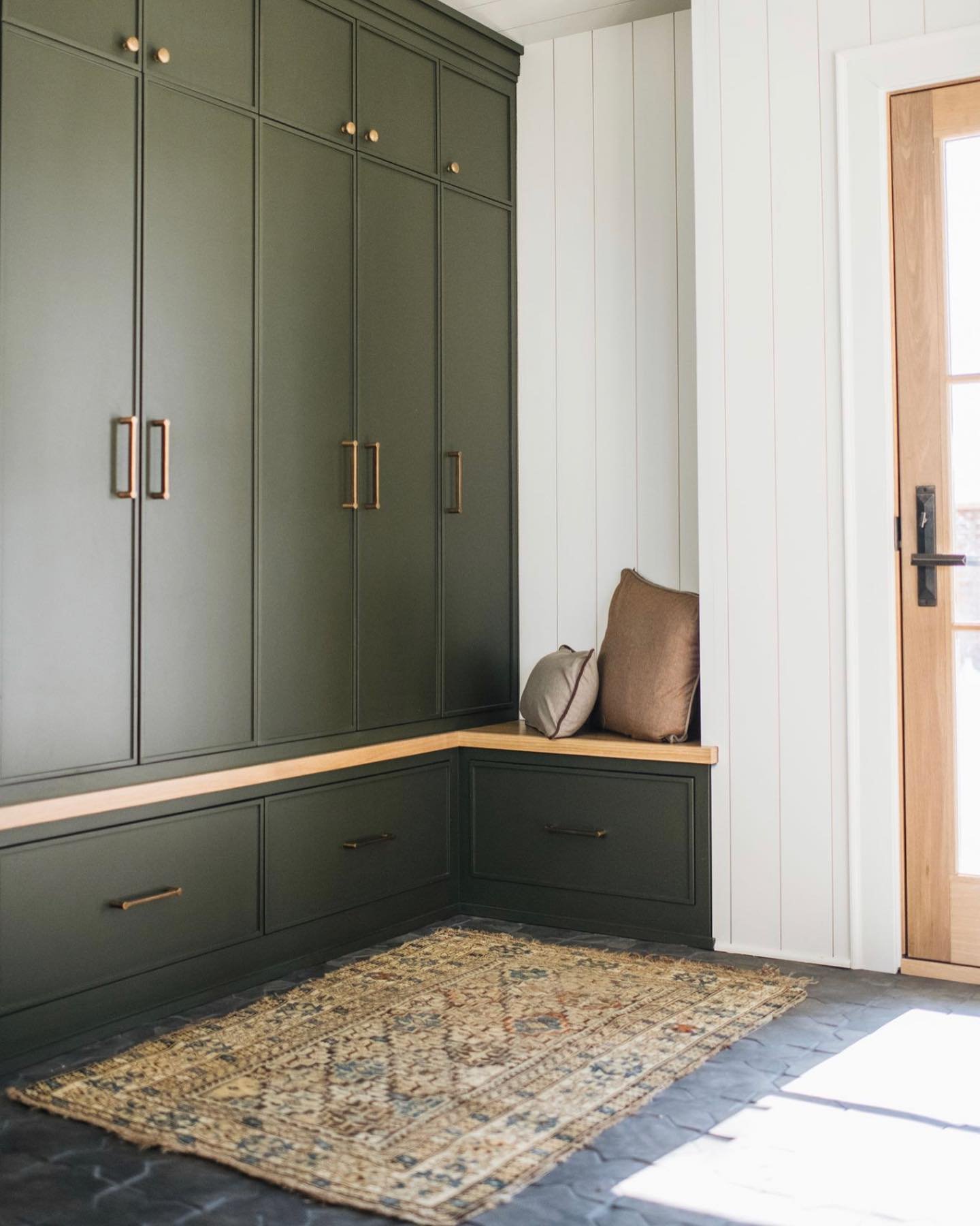
Olive Tones
You know we consider deep shades of green to be timeless. Whether used as a cabinetry color or on a fireplace facade like our River Road Remodel, a good shade of olive brings so much intensity and warmth to an otherwise neutral space. Just add plenty of natural elements for balance, and you’re set.
More to Read: 10 Paint Colors We’re Loving Right Now
SHOP THE LOOK

Design: Yond Interiors | Photography: Amanda Birnie
OCHRE TONES
The rise of ochre was one of our primary design predictions for 2022. This earthy, golden hue is a striking way to add saturation to your color palette, and we love the richness it brings to any room. As for where to use ochre? Don’t limit yourself to only pillows or small accessories. This year, we’re thrilled to be designing an entire ochre-colored kitchen that feels like such a breath of fresh air.
SHOP THE LOOK
Design: Yond Interiors | Photography: Amanda Birnie

Design: Yond Interiors | Photography: Amanda Birnie
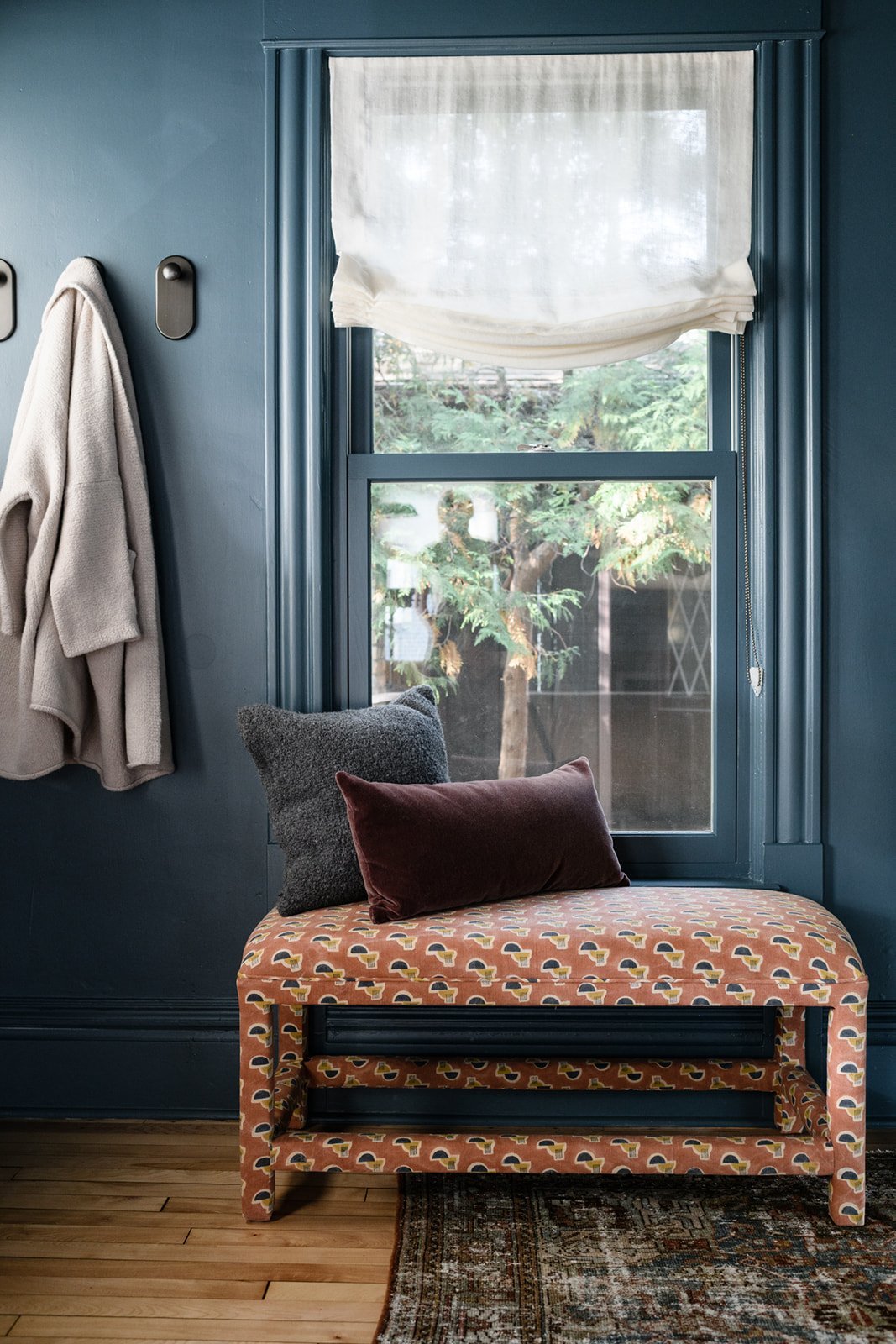
Indigo Tones
We’ve used saturated shades of indigo in our work time and time again. It all started with the River Road Remodel (see the moody kitchen island) and perhaps most notably in the living and entry space of Sheridan Ave. For this project, we painted Newburg Green by Benjamin Moore on the walls, window frames, and millwork to accentuate the home’s original architectural details. While some may have considered using such a saturated neutral to be a risk, we think the final result proves bold design decisions can ultimately pay off.
We’d love to hear how you plan to use saturated neutrals in your next project. Play around as you build out your color palette, and don’t be afraid to try something new
shop all saturated neutrals
For even more inspiration, follow us over on Instagram to get a look at daily life in the studio. If you would like to connect with us for your design project, we would love to hear from you. You can connect directly by filling out our contact form.
In Case You Missed It
Go inside our team’s spring trip to Round Top.
You can visit our newly designed portfolio of work.
Here’s what goes into our design presentations.
We shared all our design predictions for 2022.
We’re answering the most frequently asked questions for interior designers.