
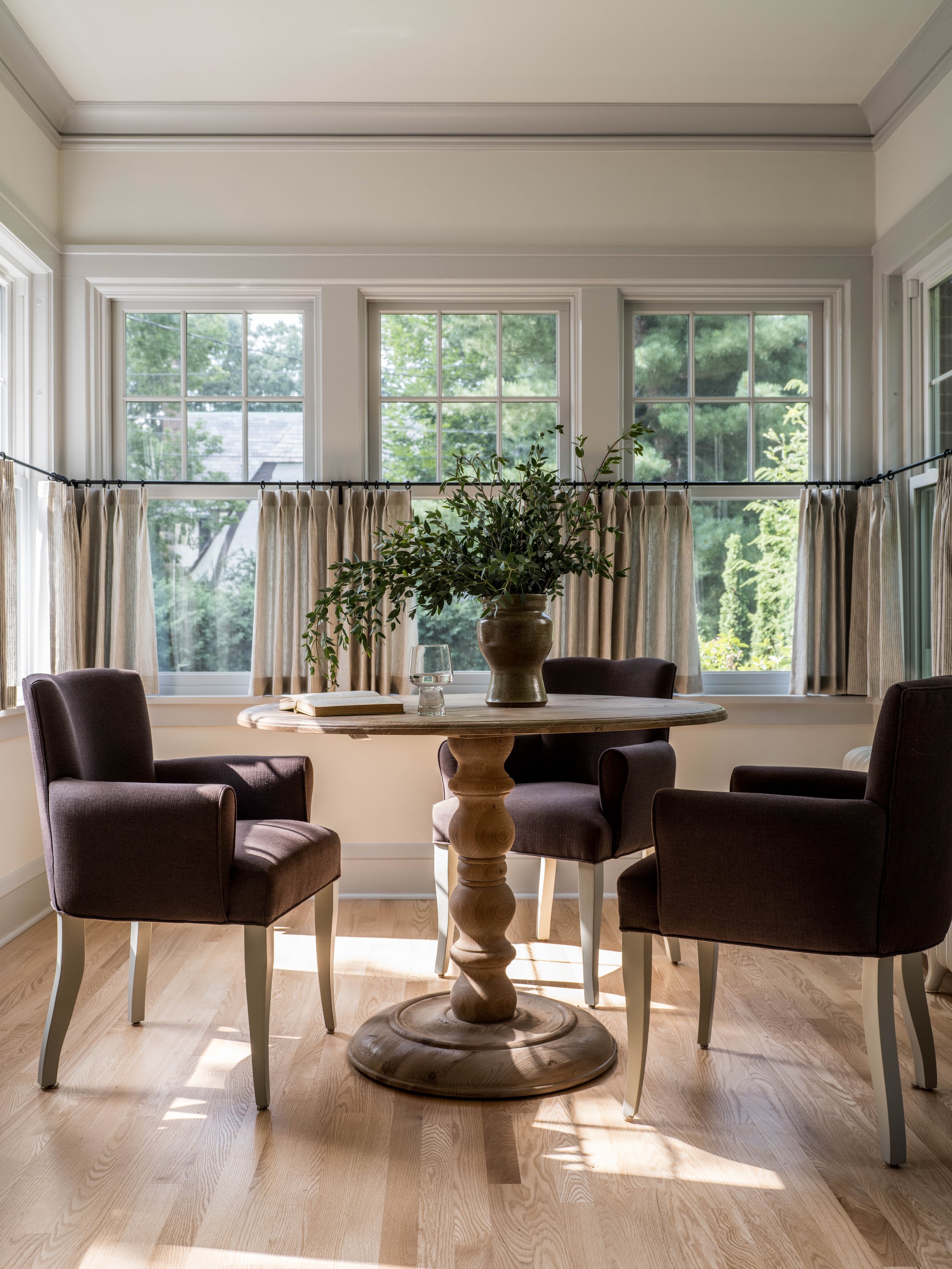
Character Study: Contrast Trim
Easily overlooked but critical to consider, trim color does not have to be white! Adding colors to your baseboards, crown molding, or other trim elements can be used to add architectural interest where there isn’t much, or to highlight trim that is substantial or interesting. Color will accentuate historical trim, making it a great choice in older properties. If a little more depth is desired, using a bold color, or even a shade similar to a dramatic wall color will certainly make a statement.
Design by Yond Interiors, Photo by Erin Little
Design by Yond Interiors, Photography by Amanda Birnie
Subtle Contrast
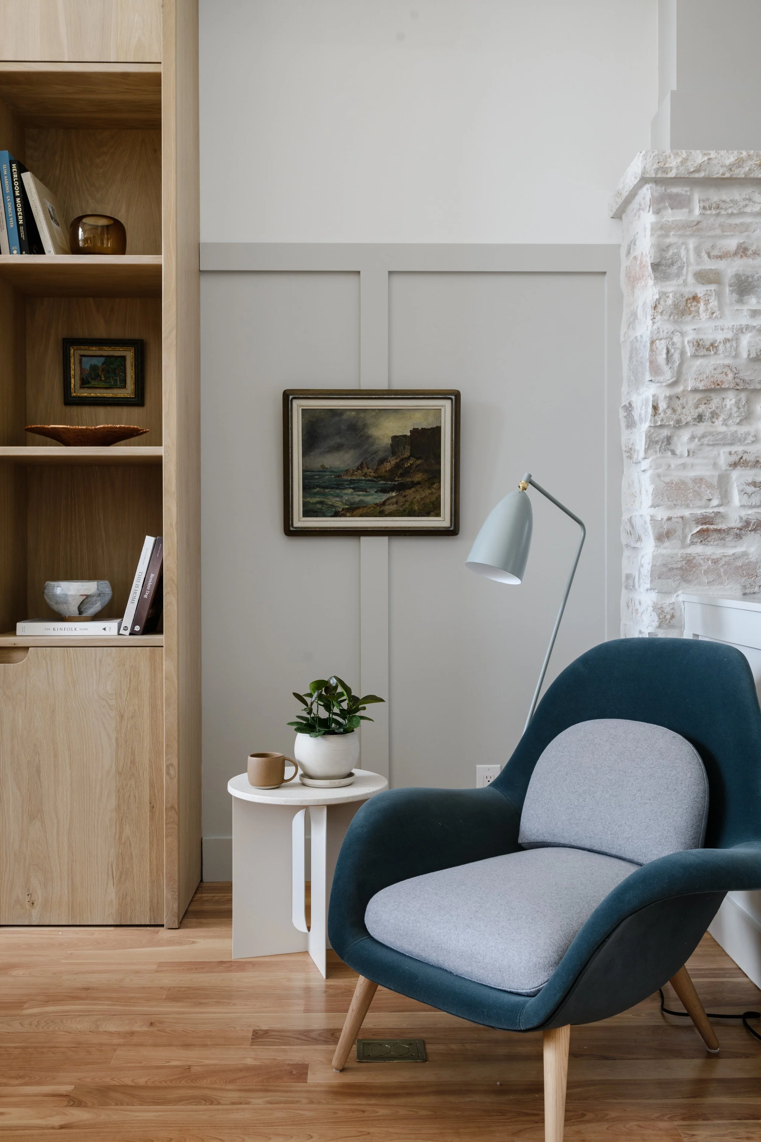
If the word “contrast” scares you off, consider that contrast can be quite subtle and still have an impact. This is where we have used this technique the most, and it works well to bring some interest into a room while keeping the palette neutral and calm. Choosing white walls with trim that is dark white or a soft gray, beige, or somewhere in between also works quite well in open floor plans where white walls with just a little more punch are called for. In the room above, we drew on the natural variations in the stone fireplace to choose a color for the board and batten wall detail, which tied the two elements together nicely.
Design by Katie Monkhouse, Photography by Bess Friday

Design by Katie Monkhouse, Photography by Bess Friday
Bold Contrast Trim
The next step is choosing a trim color that offers more contrast to the wall color. This look is perhaps more difficult to pull off, and we suggest using it when the room has more that just baseboards on the lower part of the walls. It gives a decidedly English-cottage feeling, but can still work in a more modern space, too. Otherwise, consider using dark trim with a wallpaper. I’m doing just that in my own home, updating the trim to a saturated olive green and adding a paper. I can’t wait to see it come together!

Design by Sherwood Kypreos, Photography by Sam Frost Studio

Design by Yond Interiors, Photography by Erin Little
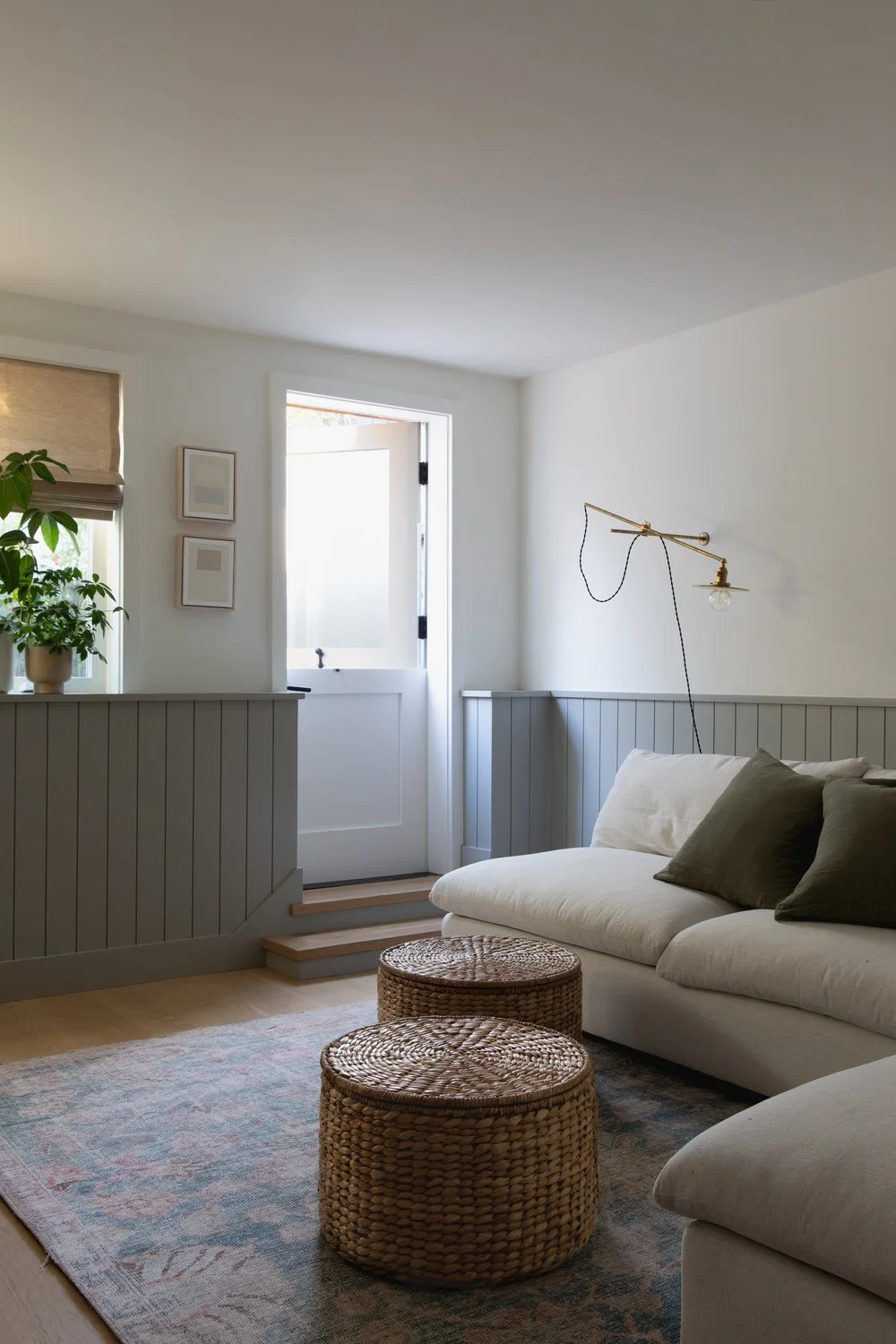
Color All Over
I noted this as a trend in last week’s post, and as the shift from mostly-white spaces to bolder color takes hold, I think we will also see more rooms saturated in one shade than rooms with bold wall colors and white trim. With a dark or saturated wall color, white trim is disruptive. So choosing the same shade — or a very close shade — for the trim has a more more calming effect and helps the walls sort of recede, rather than call attention to themselves. In the living room of our Sheridan Avenue project, we painted the walls, trim, and the ceiling the same color, using a paint with more sheen on the trim. This way, the trim still defines the room, but the color really envelops the space creating a cozy and slightly sophisticated vibe.
It’s important to remember that paint will behave differently on different surfaces, so one shade may look slightly different on sheetrock than on trim or cabinetry.

Design by Sherwood Kypreos, Photography by Sam Frost Studio

Design by Becca Interiors, Photography by Rikki Snyder
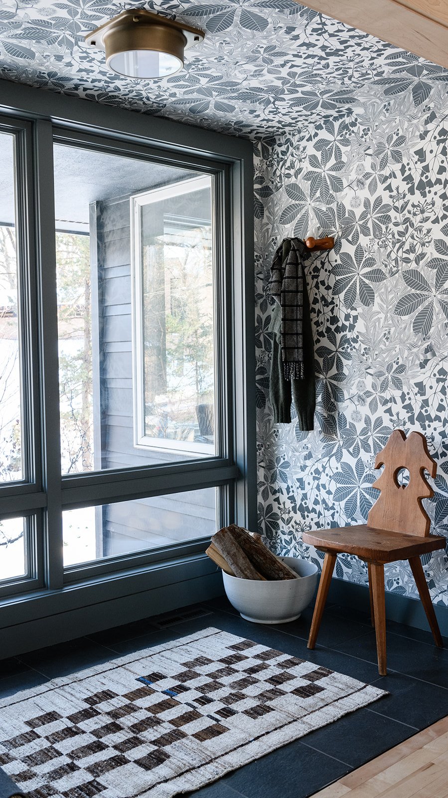
Bold Trim with Wallpaper
Speaking of 2023 trends, wallpaper is on the scene and not likely to heading out any time soon. The idea isn’t new — are any, really? — and it’s very reminiscent of trends in Colonial era, so it can lean quite classic, depending on the paper and paint chosen. We especially love to see patterns influenced by natural elements paired with a saturated neutral paint on the trim that is either taken directly from the color way of the paper or offers a bit of contrast.
Design by Yond Interiors, Photography by Amanda Birnie
IN CASE YOU MISSED IT
The latest project in our portfolio, Parklands Road.
Dark and moody paint colors for a cozy, intimate space.
Pull a room together with mirrors, lighting, textiles, and hardware.
Key features to consider when designing a guest bathroom.